Web Landmines: Thrash, Nags & Bloat
Published on
This is a rant. The wealth of information on the web is amazing, but I find it riddled with user experience landmines that make it an unpleasant medium for reading. These landmines are so frequent that stumbling on nice plain HTML page, like paulgraham.com, is refreshing and relieving, instead of normal. The modern web is awesome for web apps and rich experiences, but I wish webmasters would strive to make their informational sites resemble the printed word that has worked so well for so long. I call the annoyances that interrupt reading landmines.
Landmines can usually can be categorized as either thrashing, nags or bloat. Thrashing is the jarring experience when a new element loads and causes the layout to change and thus changes the scrolling position. Nags are full-screen overlays that obstruct the page content and usually display either advertising or mailing list sign ups. Bloat is too much of anything that isn’t text.
Thrash: you click a link, you start reading, then suddenly what you were reading is pushed off screen, so you try to scroll back. Often you get it back and its just a jarring annoyance, but often it moves again or you accidentally click on something else and leave the page. This happens most commonly on mobile. It’s so common and awful that two non-techy Dads have brought it up to me. In most cases thrash can be avoided by simply giving dimensions to placeholders. This is common with images, but rare with script injected elements, especially ads. My personal taste prefers containers that are too tall, so long as they prevent thrash. NYTimes does a great job of avoiding this, while Boston.com is notorious for it as shown in this thrash animation.
Nags, the full screen overlays that obstruct phone content, are everywhere. They’re so prevalent, there’s even a blog dedicated to hating popup modals. Not unlike thrash, they are extremely common on mobile, though Google just started penalizing them so here’s to hoping! The worst part is that nags aren’t an accident, they’re deliberate. A common narrative is that webmasters cave to demanding marketing managers, and add the nag despite believing that they are bad user experiences. The only way to avoid them is to not write the code! Here is an example.
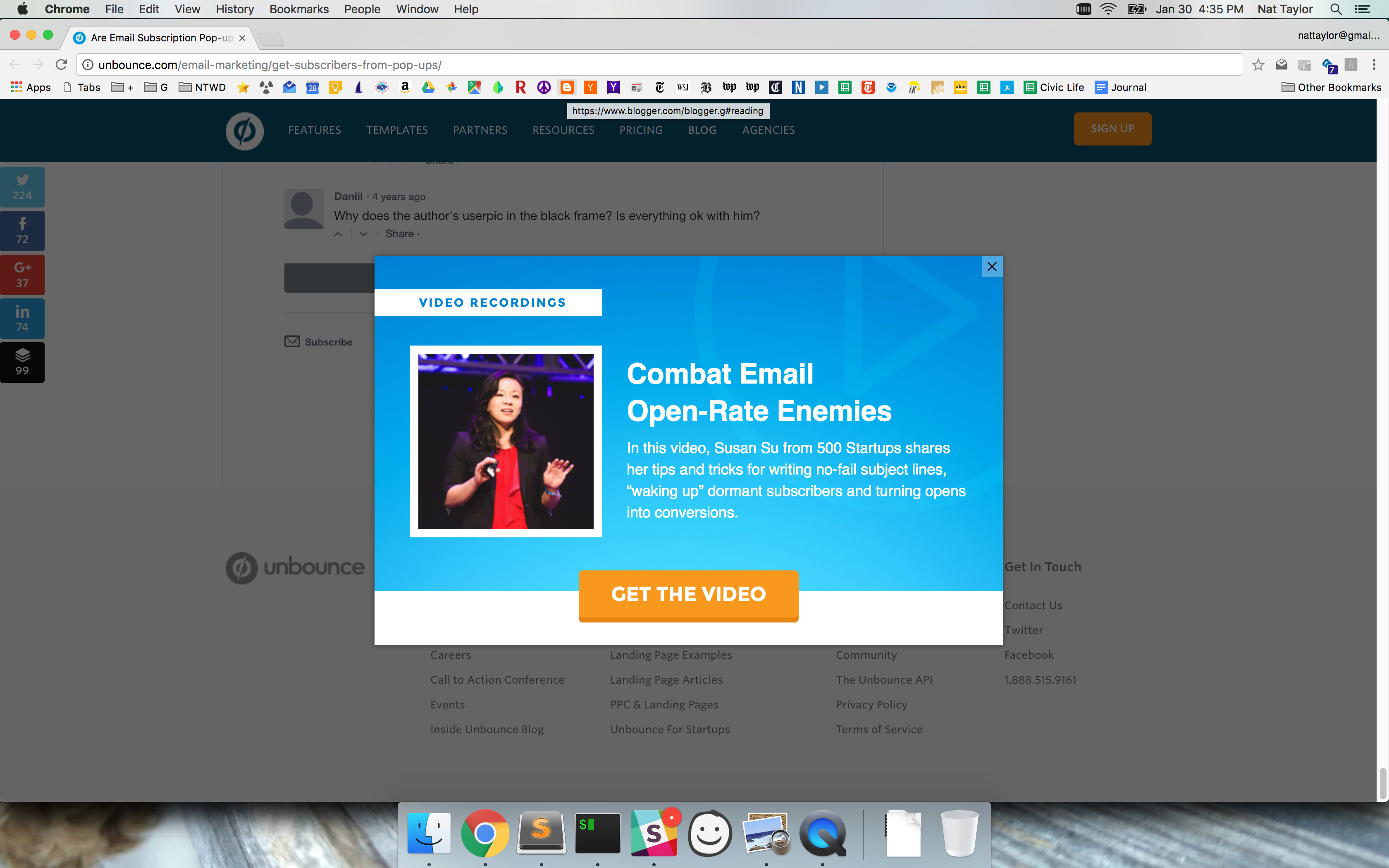
There’s no objective definition of bloat, but it’s a well known topic even the New York Times has covered. It’s uncertain definition makes it the hardest to prevent. Perhaps the simplest measure could be whether or not a site has two or more bloat-y things: too many or bad ad placements, too many tracking pixels, low ad relevancy, too many images or too much Javascript. Take www.zerohedge.com for example. In order to load 20 story snippets it asks the client to do 3118 requests, 10.6MB, XHR: 201, JS: 1238, CSS: 15, Image: 837, Media: 3, Font: 17, Doc: 333, Other: 436, Cookies: 36 domains. You have to see the DevTools screenshot to believe it. Almost all of it is user tracking, which perhaps isn’t aligned with the site’s mission of “anonymity is a shield from the tyranny of the majority.”
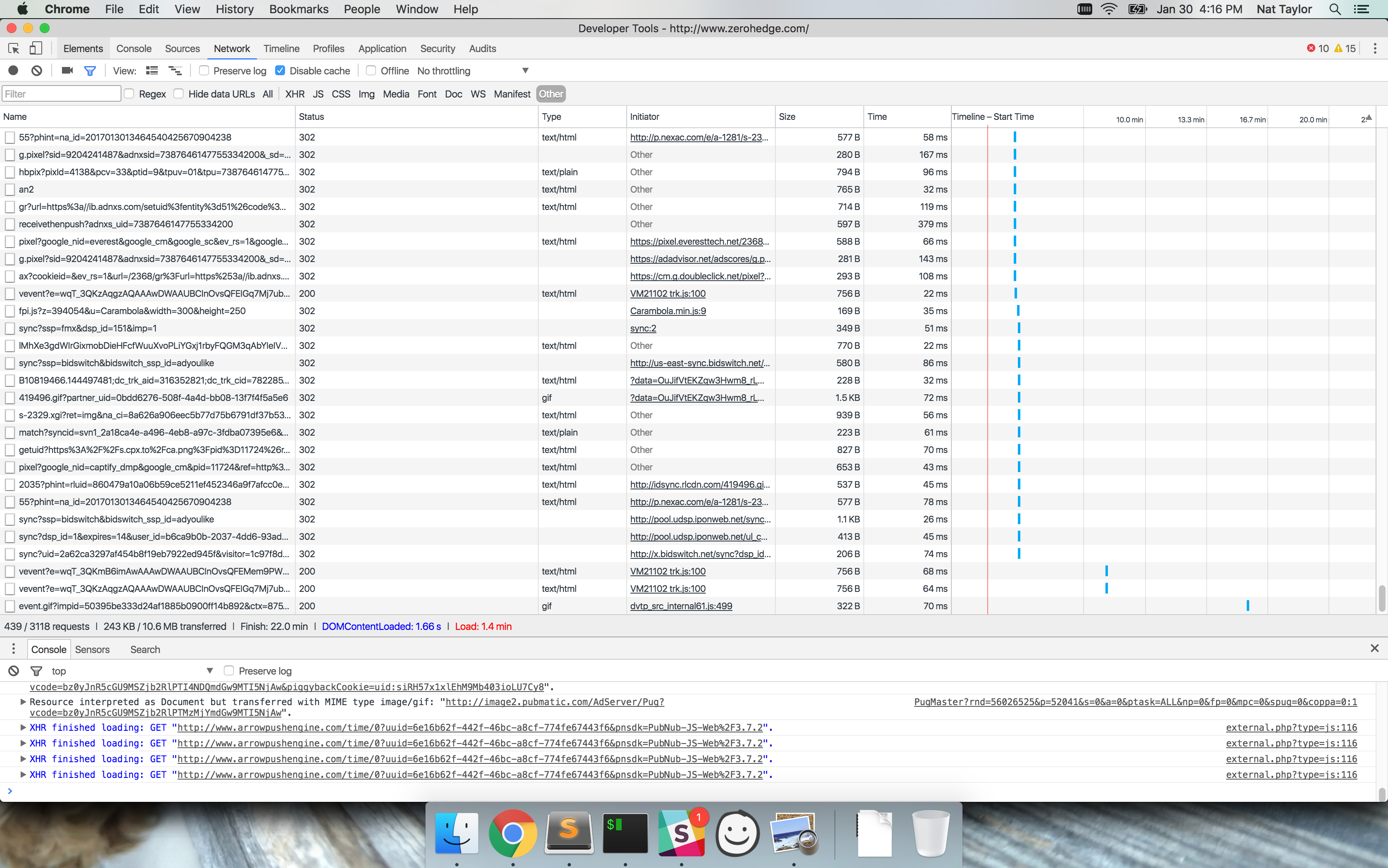
There’s lots of more specific examples, especially in advertising, that I haven’t addressed here but may in the future. Google has noticed, and has penalties in place for some of these. My site isn’t perfect, but it doesn’t have any of these landmines. Please consider your readers and make wonderful sites that are a joy to read.